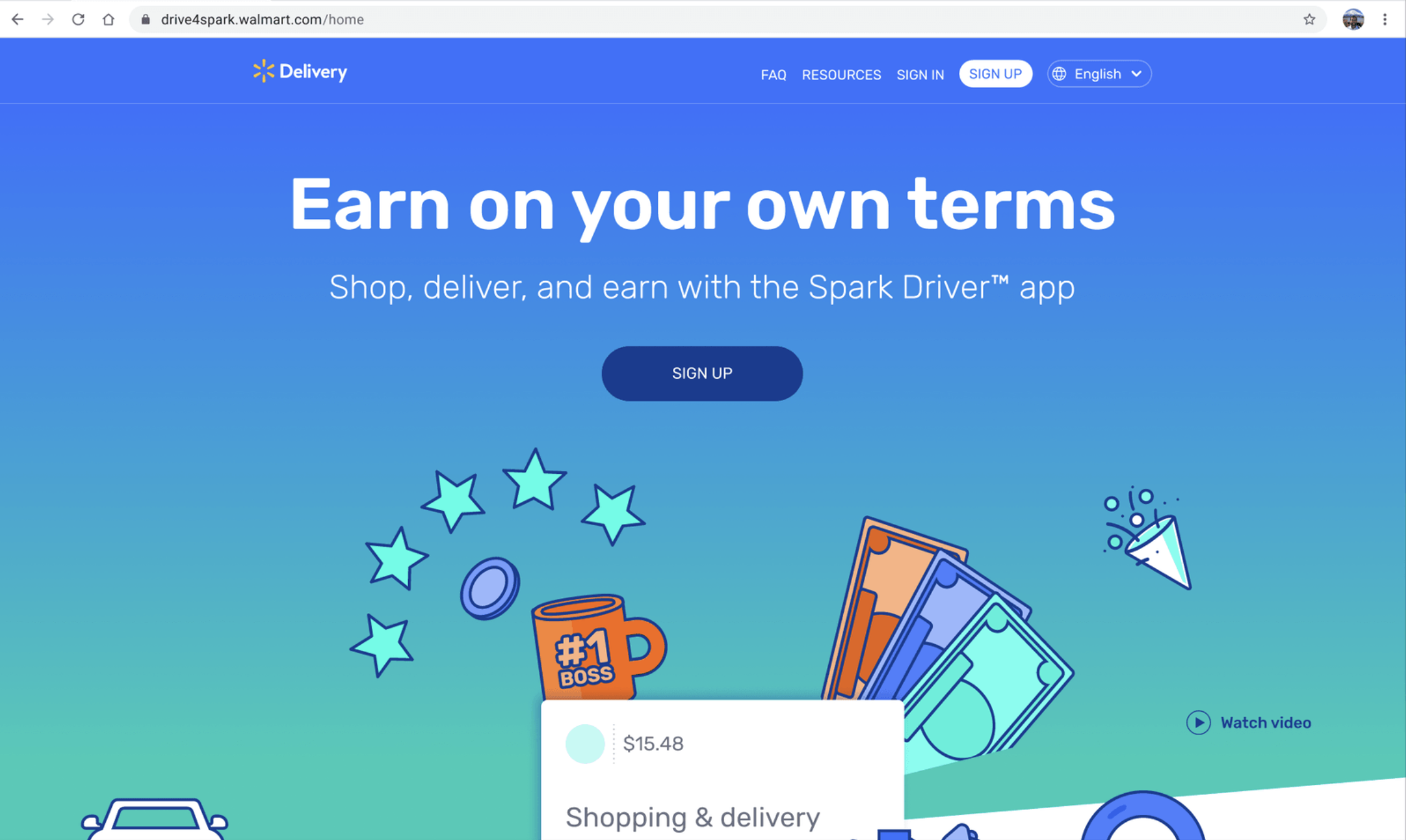
Spark Driver
Spark Driver (B2C) is an app that connects independent contractors with shopping and delivery opportunities from Walmart and other businesses. I was the Lead Content Designer/Strategist from 2021–2025. The app also had two other Content Strategists that I directly managed.
UX content
Signup
Problem: About 55% of people who visited the Spark Driver website signed up to become drivers, but only 15% actually completed their first delivery. A major drop-off happened during the enrollment process, which was clunky and disconnected. Users were bounced between email instructions and a third-party portal that didn’t align with the Spark Driver brand or voice.
Solution: I partnered with Design to rethink and centralize the entire signup experience directly on the Spark Driver site. Here are a few key changes I pushed for:
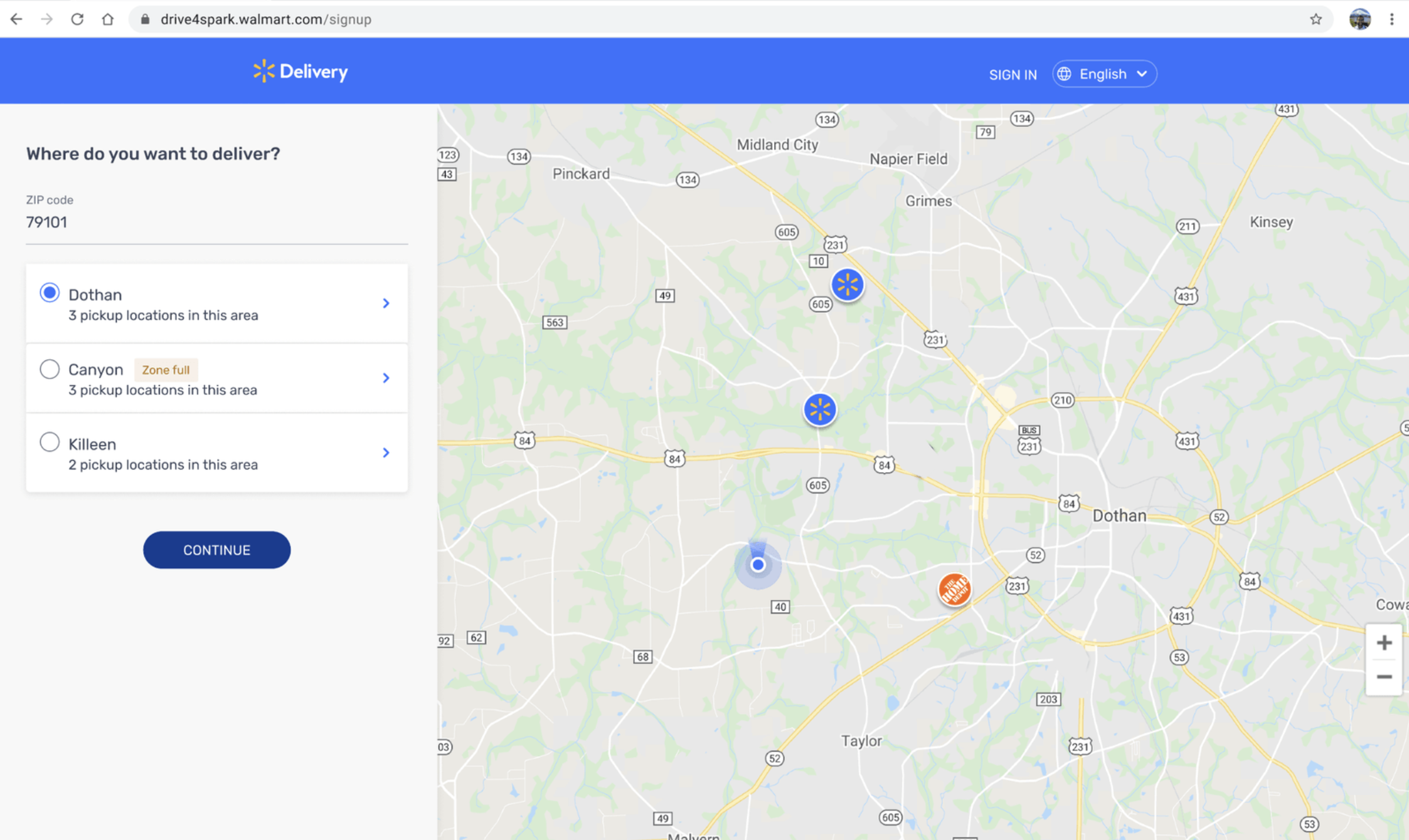
Full zone transparency: Previously, users only found out a delivery zone was full after completing the entire signup process, just to ultimately end up on a waitlist. I proposed implementing tags to show when zones are full at the beginning of the process. If a user still tries to select one, we now invite them to join the waitlist — making it a choice, not a surprise.
Nearby zone discovery: The site originally showed only the zone tied to the ZIP code entered. I recommended surfacing nearby zones as well, so users could still find opportunities to deliver even if their first choice was full. This offers a better user experience by enabling users to still join and earn money, while helping us preserve the acquisition rather than lose it entirely.
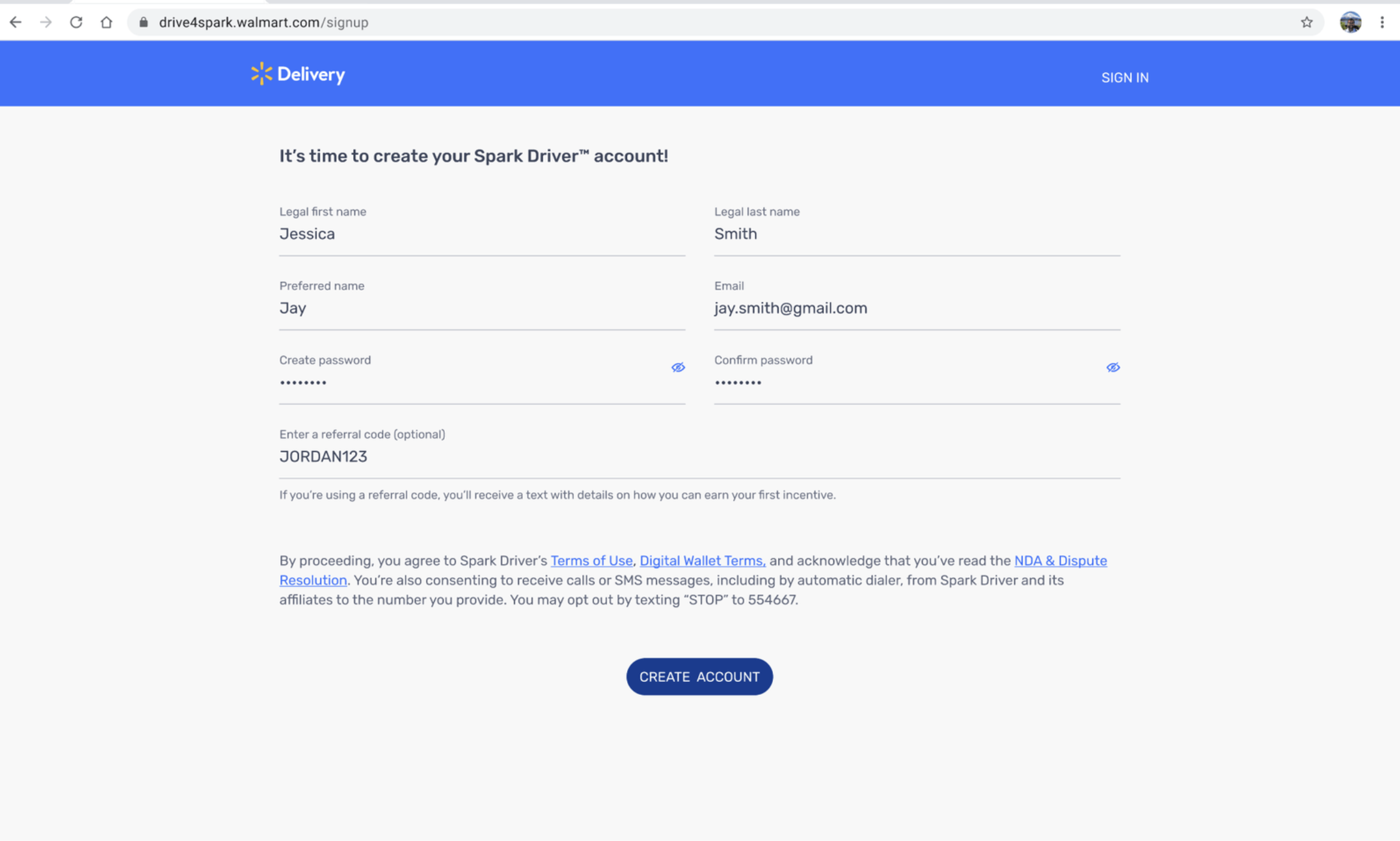
Preferred name field: I advocated for a preferred name field to promote inclusivity. Despite pushback, I educated stakeholders on the benefits of inclusive design and gained legal support. My team later reconsidered the term “preferred name.”
Impact: This work led to a 60% annual reduction in signup-related support tickets, a consistent 4–7% monthly growth in new driver activations, and a lower overall cost of driver acquisition.
App entry redesign
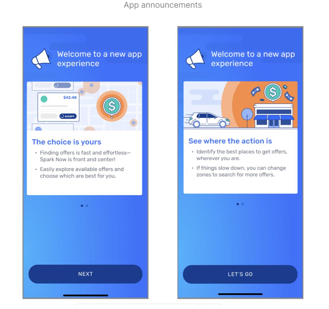
Problem: To compete with competitors, like DoorDash and Instacart, we needed to redesign the app’s starting point as a more centralized landing screen. It was originally created with a hamburger menu that forced users to navigate throughout the app to get to important parts.
Solution: By bringing offers, trips, and the delivery zone to the home screen, users can jump right in as soon as they open the app. I was particularly focused on assessing components, content placement, and using precise language to make this huge redesign a seamless transition for users.
Impact: This initiative is expected to improve driver utilization by +2.5% and increase accepted offers.

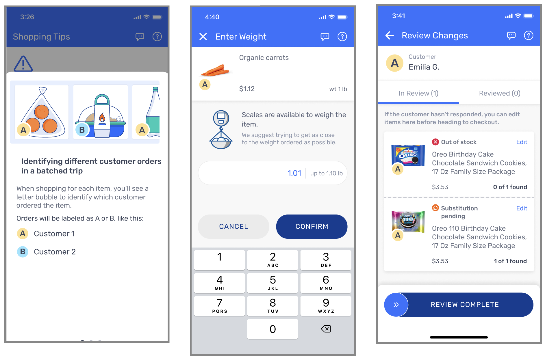
Batched shopping
Problem: Prior to this initiative, Spark Driver users were only able to shop for one order at a time. Our Walmart associates had to fulfill all other orders.
Solution: Offering Spark Driver gig-workers the ability to shop for multiple orders at a time means that Walmart associates are spending less time fulfulling orders. Without the proper content strategy and design walking users through the process, batched shopping would be overcomplicated and confusing. I was focused on clearly creating a way for users to systematically organize orders and reducing cognitive load during shopping and when reviewing order changes. This included creating UI labels for each order, clearly showing items that belong in each order, and offering helpful tips for keeping orders separated in carts and when loading them in vehicles.
Impact: This initiative is expected to save $46M in fulfillment costs and offer higher-paying shopping opportunities for users.
Other major content design initiatives
I also led content design for these high-impact initiatives:
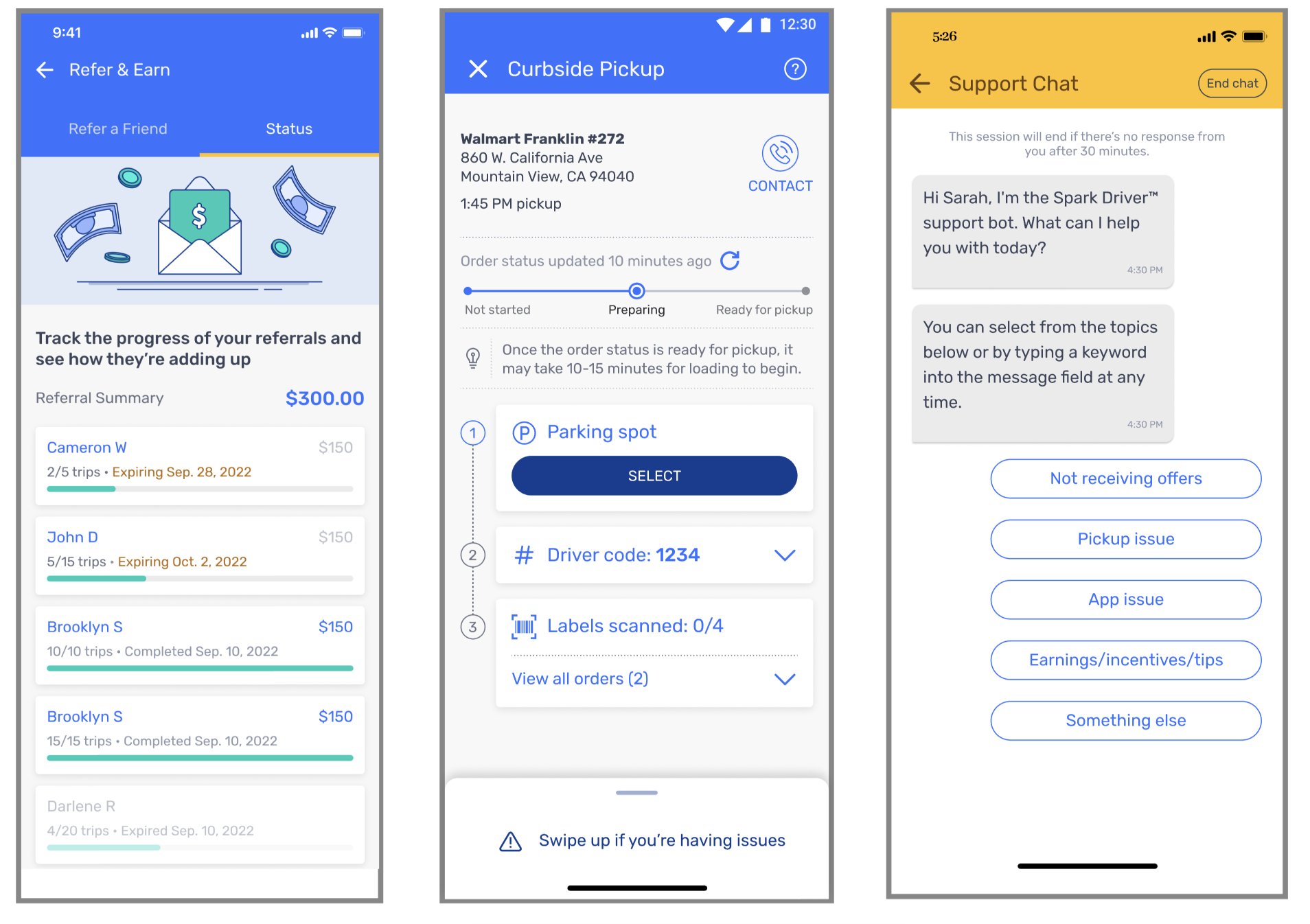
• Refer & Earn program: Provides Walmart with no-cost platform recruitment
• Order status redesign: Expected to save $18.8M in support costs and reduce dwell time
• Support chatbot: Expected to save $10.9M in support costs
Brand & style
Spark Driver Style Guide
Problem: My team was brought in due to the app's low ratings, a high volume of Driver Support calls, and concerns from leadership about the quality of the content. Additionally, much of the content across the platform didn’t comply with legal guidelines, which heightened the risk of litigation.
Solution: I led a cross-functional campaign to create a brand strategy and overhauled the existing platform's content. To create the style guide, I led discussions with all cross-functional partners. While collaboration was key, it was my job to make the final decisions on most aspects of the style, including branding and personality. Working closely with the Research team, I leveraged user data to shape many of the decisions. I continued to refine guidelines as we gained more feedback about terms, language, and writing style. Ultimately, I learned through leading this project how imperative it is to treat style guides as living documents, changing and evolving with the user base.
Continued challenges and design-system solutions: Despite documenting all content guidelines, I quickly discovered that implementing this guide wasn’t enough to guarantee consistency or prevent errors across the platform. To address this, I partnered with our Design team to create a content design system directly in our UI kit, ensuring consistency in casing, CTAs, body text, headline length, word choice, etc.
Help articles
As a subject matter expert on the app, I had the opportunity to help the Driver Support content teams build a knowledge base with over 70 articles. I also led the localization of this knowledge base by hiring and managing a translator to provide Spanish articles for our 30% of Spanish-speaking users.